How I Increased Demo Requests by 47% Without Spending a Rupee More on Ads?
A B2B SaaS company had all the traffic. What they didn't have was a landing page that converted it. I ran a structured A/B testing program, rewrote the buyer conversation, and turned their biggest leak into their best-performing growth lever.
Resources
Aug 24, 2026
Author - Mohana J

The Problem
Traffic was never the issue. The page was.
A platform switch. A page that stopped converting. A business quietly bleeding pipeline.
A B2B SaaS company in the compliance automation space had done the hard part. They had built a strong inbound machine, paid search driving high-intent queries, a content engine generating organic traffic, retargeting campaigns keeping the brand in front of warm audiences.
And then they looked at the numbers. Their primary demo request landing page was converting at 2.3%. The category benchmark for comparable mid-market SaaS products sits between 4% and 6%. They were leaving more than half their qualified visitors on the table, every single day.
"We have the traffic. We have the product. Why isn't anyone booking a demo?", the question I hear before almost every CRO engagement.
The honest answer: because your page is talking to the wrong version of your buyer.
The traffic data was telling a clear story. Paid search visitors were the highest-intent, bottom-of-funnel segment were converting at 3.1%. Organic blog visitors and retargeted audiences were converting at under 1.5%. The page wasn't built for the majority of people landing on it. It was optimized for one segment and ignoring the rest.
The Diagnosis
What was actually broken and why nobody could see it yet?
Six data sources. One clear pattern. The page was failing at the trust layer, not the feature layer.
Before forming a single hypothesis, I ran a full research sprint across six sources: Google Analytics, heatmaps, session recordings, Search Console keyword data, CRM lead quality reports, and competitor landing page analysis.
What emerged was consistent across every source.
72% never scrolled past the hero: The entire feature section was invisible to the majority of visitors. The decision to convert or not was being made in the first 10 seconds.
Form drop-off at field: The "Annual Revenue" field was the single highest abandonment point. Buyers in evaluation mode weren't ready to disclose financials before experiencing the product.
Wrong message for the intent: Search Console data showed evaluation-stage queries. The page was showing awareness-stage copy.
Social proof wasn't working: A logo wall with no attribution, no outcome, no role. For risk-averse compliance buyers, brand names without context aren't trust signals — they're decoration.
The exit rate on the page was 68%. More than two-thirds of visitors were leaving without any action. That's not a traffic quality problem. That's a page conversation problem.
The Hypothesis
What I believed and why?
Primary Hypothesis
If we replace the feature-centric headline with an outcome-focused statement that speaks directly to the buyer's role and pain, simplify the form to four fields, soften the CTA framing, and add a specific attributed proof point above the fold, then form completions will increase by at least 25%, because we will reduce cognitive friction and improve identity resonance at the moment of decision.
The psychology at play here is straightforward. Buyers in active evaluation mode which is most of the traffic arriving at this page are not asking "what does this product do?" They already know that. They're asking two much more fundamental questions: "Is this built for someone like me?" and "Can I trust these people?"
The control page answered neither. It led with capability messaging for a buyer who had already passed the capability-discovery stage. The hypothesis was that meeting buyers at their actual psychological position such as identity validation first, trust signals second, features third would unlock the conversion potential that the traffic volume already represented.
The Work
Every change made and why each one earned its place
This wasn't a redesign. It was a buyer conversation rewrite, executed through structured experimentation.
#1 Headline: Feature-Led → Outcome + Identity
Changed from "Automate Your Compliance Workflows" to "Give Your Compliance Team a System That Actually Works." The new headline names the role, implies the current failure state, and promises resolution without a single product feature in sight.
#2 Subheading: Added Objection Handling
Introduced ICP-specific language that addressed the #1 sales objection upfront: "Purpose-built for compliance teams in regulated industries without the IT dependency or six-month implementation." Sales objections belong on the landing page, not in the first discovery call.
#3 CTA Copy: Commitment Reduction
Replaced "Request a Demo" with "See It In Action." Both lead to the same form. But "See It In Action" frames the experience as educational rather than transactional. For compliance buyers who dread sales calls, that framing difference matters.
#4 Form: 7 Fields → 4 Fields
Removed Annual Revenue, Company Size, and Job Title as mandatory inputs. Replaced with a single "Primary Use Case" dropdown that gave sales better pre-call context than revenue data anyway. Qualification moved to the post-submit enrichment layer.
#5 Social Proof: Logo Wall → Attributed Customer Quote
Replaced the generic logo wall with a single, specific quote: role, company type, and a quantified outcome. One real proof point placed directly above the form outperformed eight unattributed logos. Specificity is trust.
#6 Trust Badges: Footer → Above the Fold
Moved SOC 2 and ISO 27001 certifications from the footer to immediately adjacent to the form. For regulated-industry buyers, these aren't decorations, they're permission signals. Placing them at the friction point produced a measurable lift in form start rate on its own.
#7 Secondary CTA: Added a Lower-Commitment Path
Added a "Download the Buyer's Guide" option below the primary CTA. This captured visitors who weren't ready to book, creating a new nurture cohort that produced 4 SQLs within 60 days. It didn't cannibalize primary conversions. It added an entirely new conversion stream.
The Outcome
From a leaking funnel to a top-performing acquisition channel
28 days. 50/50 traffic split. 97.2% statistical significance.

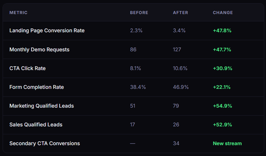
Lead quality held. The MQL rate stayed stable at 62–63% across both variants. The SQL conversion rate actually improved slightly, from 33% to 34%. Removing the revenue field didn't reduce lead quality, the "Primary Use Case" dropdown was more actionable for sales than revenue data had ever been.
At 60 days post-test, SQL-to-opportunity progression for leads from the variant period tracked 14% higher than the control cohort. Better message-to-lead alignment meant buyers arriving through the variant were more genuinely self-qualified.
The Insight
What this experiment actually proved?
The highest-impact changes isolated through a follow-on micro-experiment were the headline reframe and the attributed proof point together. Form length reduction alone produced only a 7% lift. The combination of identity-first messaging and specific trust signals drove the majority of the uplift.
That's the core insight. Buyers at this stage of the funnel aren't evaluating features. They're evaluating risk. The control page was treating every visit as a feature discovery moment. The variant treated it as a trust-building moment. The variant won decisively.
"Website optimization isn't a design project. It's a buyer psychology project. The design just makes the psychology visible."
What worked
Identity-first headlines, outcome-specific social proof, trust badge placement adjacent to the form, and a softer CTA framing. Every change that reduced cognitive load or increased psychological safety at the point of conversion produced a measurable lift.
What didn't work
An embedded 30-second product video in the hero section showed no positive impact on scroll depth or CTR and slightly degraded mobile load time. It was removed before final results were read. Above-the-fold video requires far more optimization to perform like autoplay, mute state, thumbnail than it's worth without dedicated testing.
The surprising finding
Moving the SOC 2 and ISO 27001 badges from the footer to immediately adjacent to the form produced approximately a 6% improvement in form start rate — with no copy change at all. Placement matters as much as presence. Compliance certifications are permission signals, not credentials. They need to live where the anxiety lives.
Next experiments to run
Personalized hero copy by traffic source (paid search vs retargeting), a two-step conversational form flow, a "Chat with a product expert" third conversion path, and a pricing transparency test to reduce post-demo sales cycle length.
Bigger Picture
One experiment. Multiple GTM wins.
The work didn't stop at the landing page. The winning variant's headline and subheading became the canonical product positioning language — adopted across the website, sales deck introduction, and one-pager templates. The experiment had functioned as a quantitative message testing mechanism, replacing subjective internal positioning debates with buyer-validated language.
The CTA copy ("See It In Action") was rolled out to paid search ad copy within two weeks, improving message-to-landing-page match. Ad Quality Scores improved. Effective CPC dropped. The same traffic was now entering the funnel through more aligned language at every stage.
The Buyer's Guide secondary CTA became a new lead nurture asset — a top-of-funnel content offer that fed a dedicated email sequence and improved the retargeting cohort quality across campaigns.
This is the compounding effect of CRO done strategically: fixing one conversion point doesn't just improve that page's numbers. It improves the ROI of every upstream channel simultaneously, and generates validated messaging that strengthens every downstream touchpoint.
Your Buyers Are Searching, Will They Find You?
Let’s build a marketing strategy that drives visibility, trust and inbound leads.